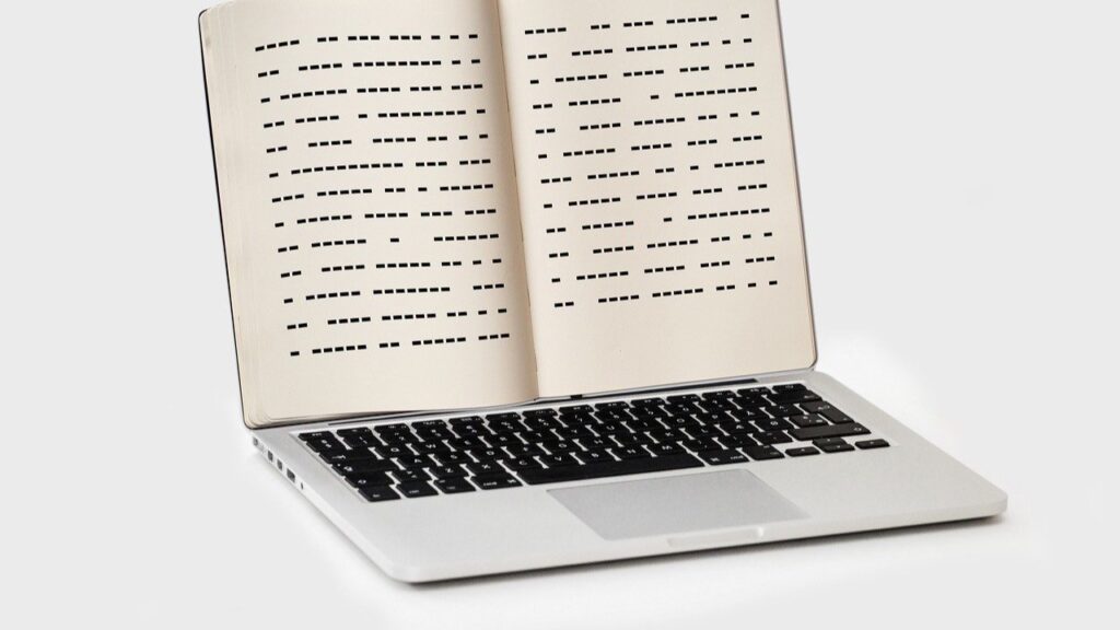
In my corporate journey and experience as a trainer in neurodiversity, I’ve discovered that often, the smallest changes in document design can significantly enhance readability and accessibility- especially for those with dyslexia. So I’d like to share some tips on how to format your documents to be more accessible.
1. Choose the Right Font
The choice of font is crucial in document design for dyslexia. Fonts like Arial, Helvetica, Calibri, and Verdana are known for their clear, evenly spaced characters, which help in reducing visual confusion. Avoid using fonts with overly decorative or condensed letterforms, as they can blur together and cause difficulty for readers with dyslexia.
2. Use Appropriate Font Size and Spacing
Increasing the font size slightly and using a good amount of line spacing can make a significant difference. I recommend setting the font size to at least 12-14 points and using 1.5 to 2.0 line spacing. This helps in reducing the ‘crowding’ effect of text, making it easier for dyslexic readers to track lines and find their place after looking away.
3. Employ Strategic Use of Headers and Bullet Points
Organising information with clear, bold headers and bullet points helps break down information into manageable chunks. This structure guides the reader through the text and helps them focus on key points without getting overwhelmed by dense paragraphs.
4. Apply Colour Contrasts Thoughtfully
High contrast between text and background can improve readability, but the choice of colours is important. Dark text on a light (not white) background tends to work best. Avoid harsh contrasts, like black on white, as they can cause glare and strain the eyes. Soft colour backgrounds such as pale blue, peach or cream can really help.
5. Provide Alternatives to Text-Heavy Documents
Whenever possible, replace or supplement text with diagrams, infographics, or videos that convey the same information in a different format. These visual aids can help dyslexic readers process information more easily and ensure that they can access the same content as everyone else.
6. Consider the Overall Layout
Keep your document layout simple and consistent. Use clear margins, align text to the left, and avoid justifying text, as uneven spacing between words can be challenging to navigate. Ensure that documents aren’t cluttered; whitespace is an ally for helping to increase text readability.
These tips can transform your standard documents into tools that empower all employees, particularly those with dyslexia, to perform their best. At Unify360, we are committed to helping your management team understand and embrace these principles through our tailored neurodiverse training programs.
Don’t hesitate to get in touch, if you’re ready to make your workplace more inclusive and empower your team with the knowledge to support neurodiversity. We’re here to help!

